Work 04


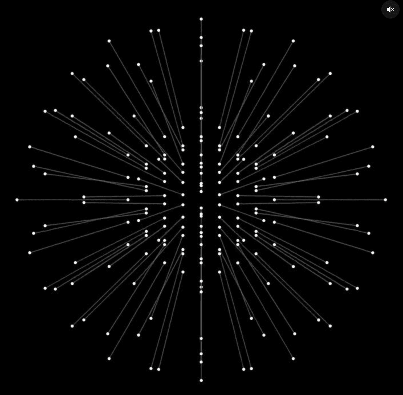
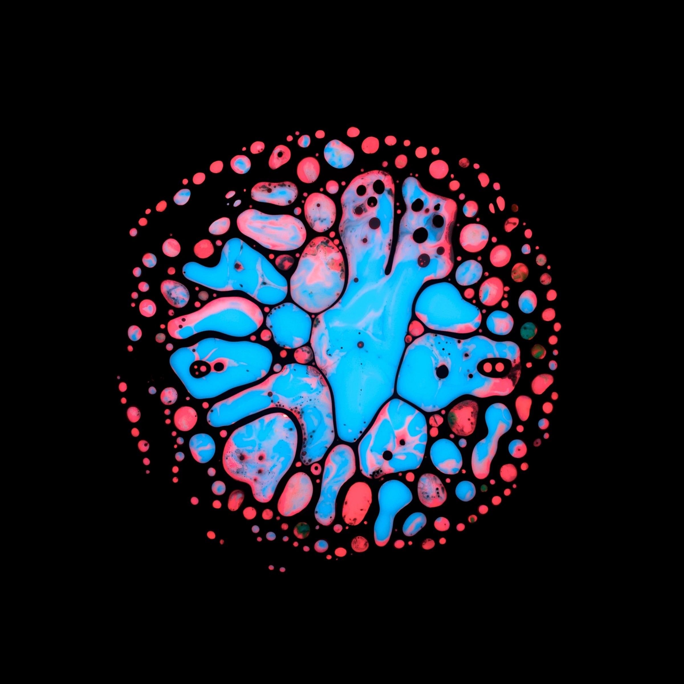
The visual system is built around a striking typographic approach and a limited but impactful color palette. Repetition and scale are used as key tools to create rhythm and memorability across layouts.
Graphic elements and patterns are inspired by Italian culture but interpreted in a contemporary, bold way — allowing the brand to feel authentic without becoming cliché.
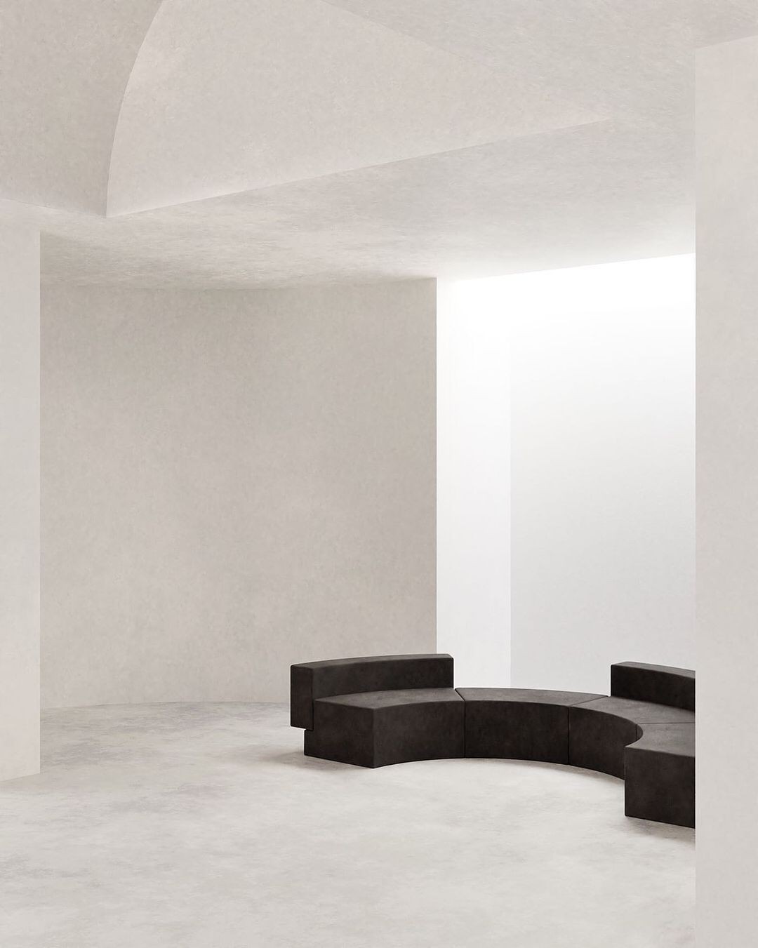
Each touchpoint was designed to feel consistent yet flexible, ensuring the identity can scale across campaigns, environments, and formats.
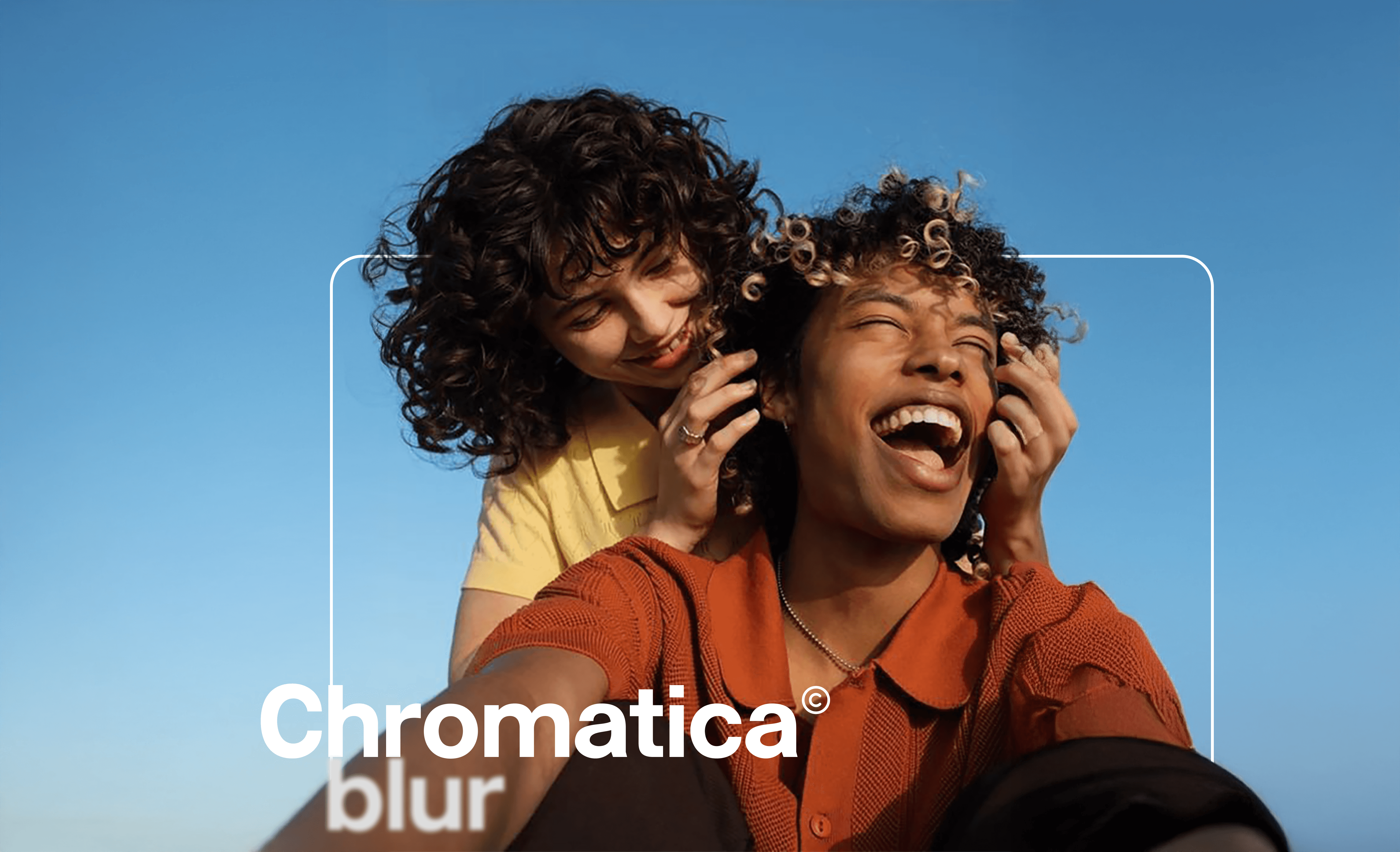
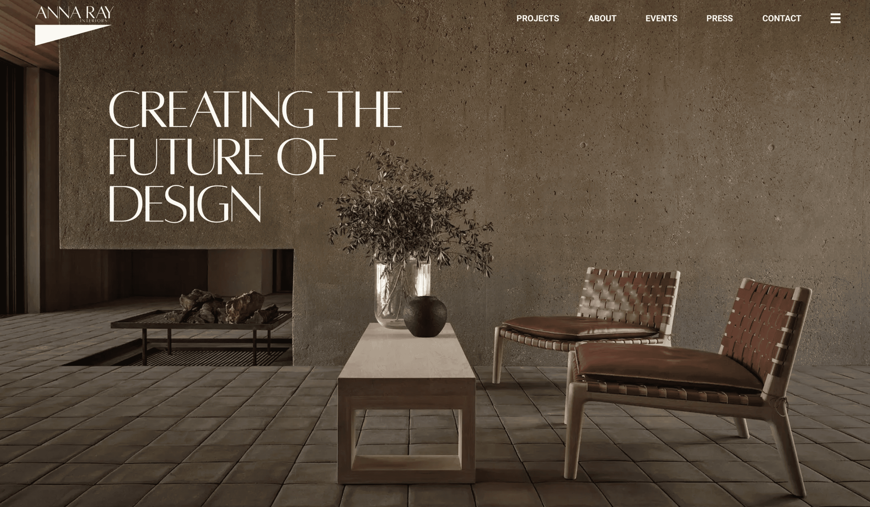
The website experience translates the brand’s bold personality into a structured and intuitive interface. Clear hierarchy and modular layouts allow users to explore content effortlessly while maintaining visual impact.
Built in Framer, the system supports dynamic content updates across menus, locations, and campaigns, ensuring the brand remains agile as it grows.
The result is a cohesive ecosystem where branding, product, and digital experience work together seamlessly.
The final outcome is a cohesive brand system that balances bold expression with functional clarity. The identity is designed to scale across locations, campaigns, and digital platforms while maintaining a strong and recognisable presence.
By aligning visual identity, product experience, and digital touchpoints, the project creates a unified brand that feels consistent at every interaction — from street-level visibility to online ordering.
Check out the entire project here.


My Work


Newsroom