Work 03


The identity
is built around clarity and confidence. A bold visual language combines strong typography, vibrant color, and playful composition to position Trusti as a fresh alternative within the insurance space.
Rather than relying on traditional financial aesthetics, the system introduces a more dynamic and human tone — helping the brand feel more accessible while staying highly recognisable across touchpoints.
The result is a visual direction that simplifies communication while keeping enough energy to attract attention in digital and campaign environments.
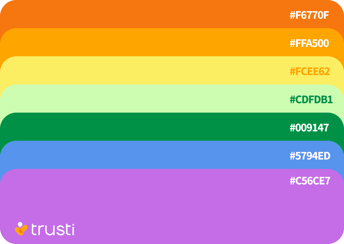
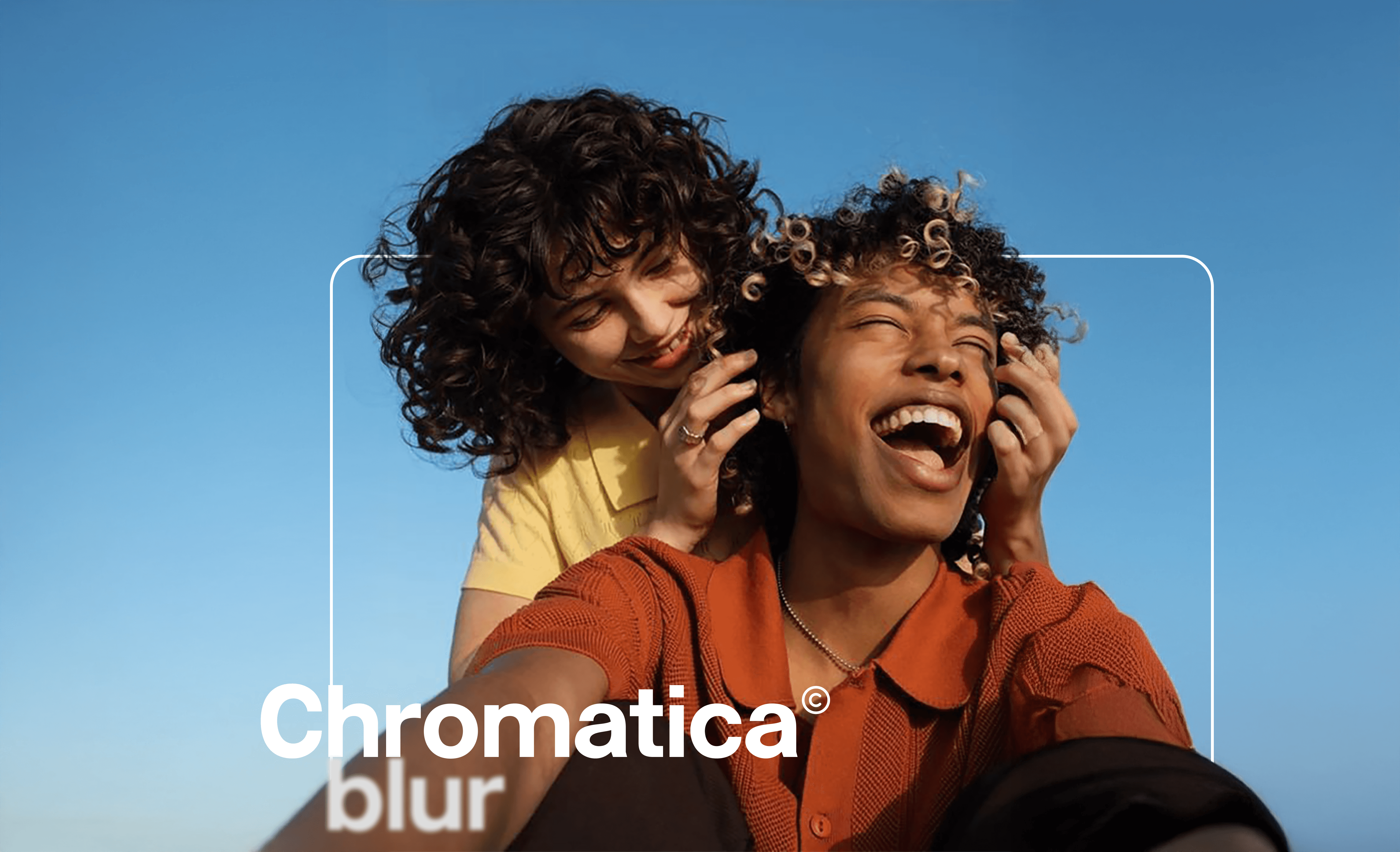
A flexible
design system was developed to work across outdoor advertising, campaign assets, product communication, and social content. Bright, high-contrast colors help the brand feel immediate and memorable, while the typography creates strong hierarchy and impact.
The campaign visuals introduce unexpected combinations of imagery, scale, and composition to make complex services feel less intimidating and more engaging. This balance between boldness and clarity helps the brand communicate with confidence without losing approachability
The final outcome
is a scalable identity system that connects branding, communication, and digital product experience into one cohesive ecosystem.
Trusti is able to show up consistently across multiple formats while maintaining a distinct and contemporary voice — positioning the startup as a modern, user-focused player in the insurance market.
View full case study on Behance →

The complete project
embraces bold, expressive visuals to challenge the traditional tone of the insurance category — making communication feel more approachable and engaging.
Behind that energy sits a clear and structured system, designed to build trust and support real-life moments, from everyday interactions to meaningful life events.


My Work


Newsroom