Work 10


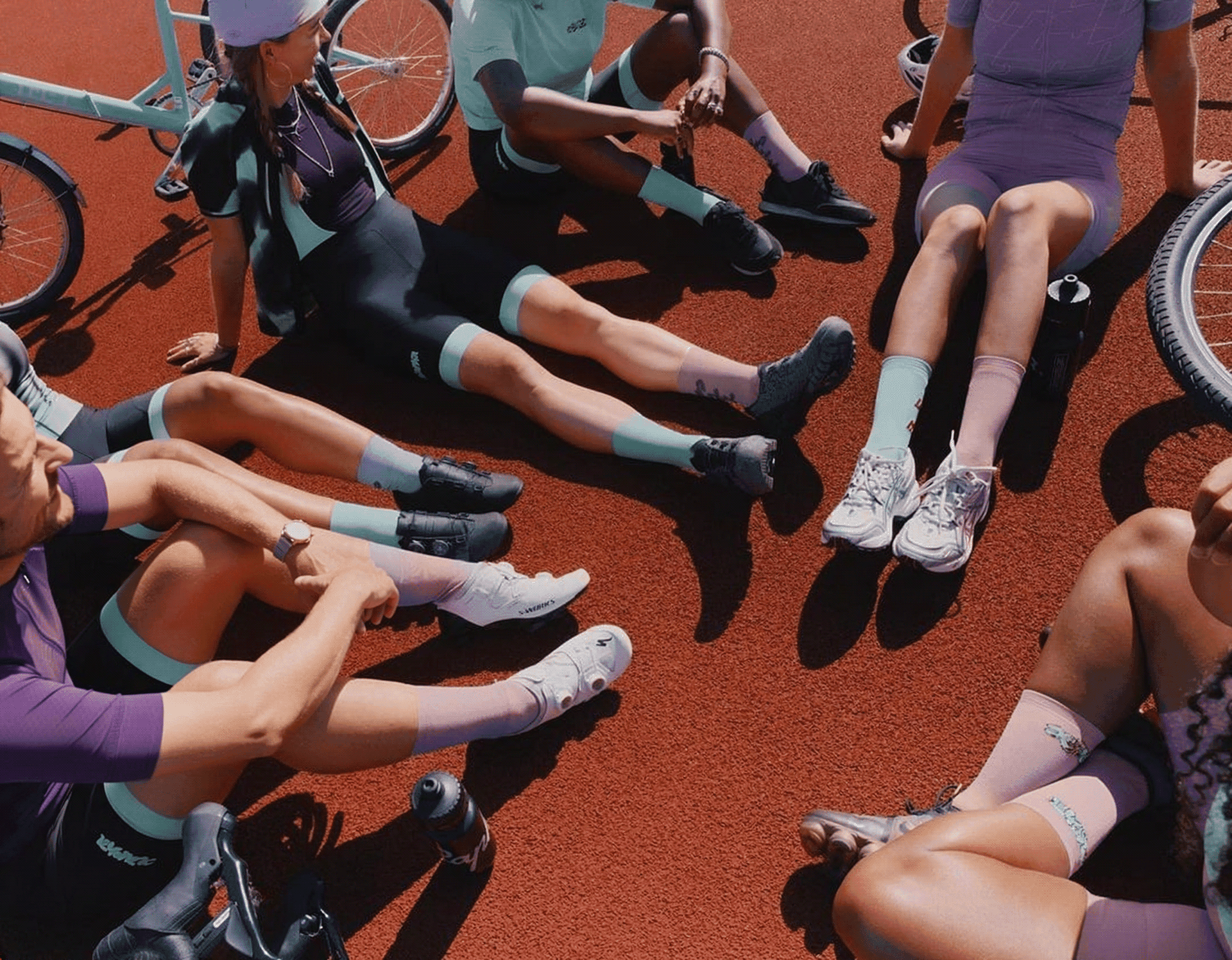
The visual direction
was built around movement, intensity, and focus.
The goal was to combine emotional energy with structured clarity — creating an experience that feels fast, aspirational, and performance-driven without losing usability.
Keywords
#Performance. #Momentum. #Focus.
This direction informed the use of bold typography, high-contrast layouts, motion-led imagery, and a clearer visual hierarchy across the experience.


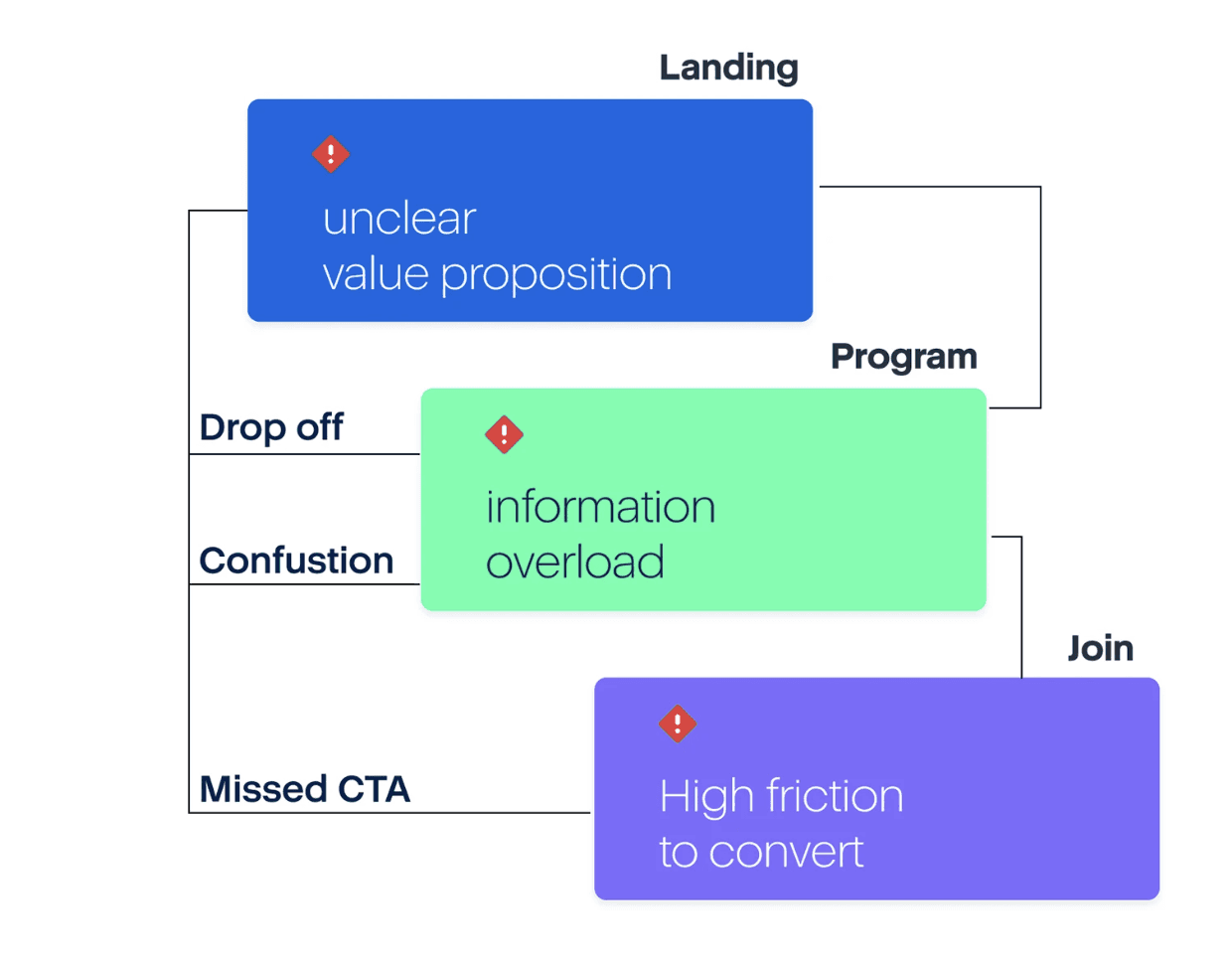
The problem
Users were exploring the platform, but not converting.
The experience was visually engaging, yet key information and actions were not easy to scan or act on.
Unclear above the fold
Weak visibility of primary calls-to-action
Fragmented content hierarchy
Too much friction between discovery and action
The goal
Redesign the experience to make the value clearer, the journey easier to follow, and the path to conversion more direct.
/ Clarify the value proposition
/ Improve content hierarchy
/ Strengthen CTA visibility
/ Reduce friction in the conversion flow
The redesign was built around a simple conversion journey.

See the full project on → Behance.


My Work


Newsroom