Work 03


Research, System & Design
The project began with understanding how users interact with commodity data across industries. Despite the diversity of markets, workflows revealed consistent patterns — users needed clarity, speed, and a reliable way to navigate complex information.
We looked at:
Existing Fastmarkets products and interfaces
Competitor platforms and financial tools
User workflows across analysts, traders, and decision-makers
Key Observations
Across all industries, the same problems emerged:
Information overload without hierarchy
Interfaces built around data, not users
No clear visual language connecting products
Heavy reliance on spreadsheets and external tools

While industries differed, user needs were fundamentally aligned.
This revealed an opportunity to move away from fragmented solutions and instead design a unified system that adapts across markets, providing consistency without losing flexibility.


System Approach
The solution was built as a modular system — where structure, color, and imagery work together to simplify complexity.
A core intelligence layer connects all datasets, while industry-specific variations provide context without breaking consistency.

Color as Navigation
A structured color system was introduced to represent industries and guide navigation.
Purple — Core platform
Blue — Automotive
Green — Agriculture & biofuels
Red — Risk & FMCG
Gold — Metals & mining
This enables instant recognition and reduces cognitive load when moving across datasets.


Imagery System
Imagery was divided into three functional categories:
Brand imagery — conceptual compositions combining product and raw materials
Market imagery — real-world industry context
Insight imagery — data-driven visuals and overlays
This creates a clear visual hierarchy between storytelling, context, and information.


System Thinking
The platform behaves as an interconnected system — where each component fits into a larger structure.
Like an engineered product, complexity is broken down into clear, modular parts, enabling scalability across industries without losing coherence.

Digital Experience
The website was redesigned as a clear entry point into a complex ecosystem of data, products, and insights. The focus was on simplifying navigation, improving hierarchy, and enabling users to quickly access relevant information across industries.

Navigation & Structure
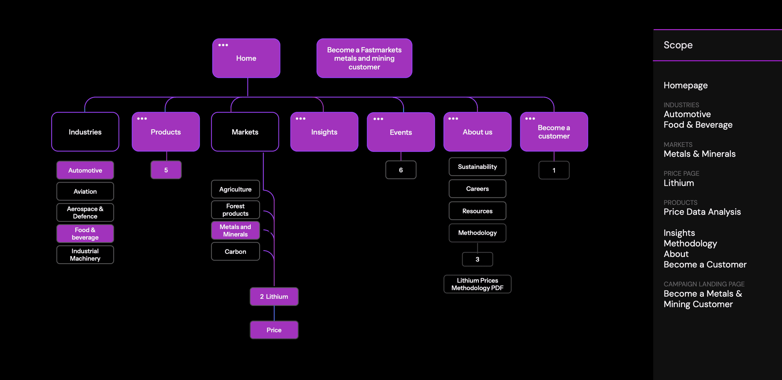
The information architecture was restructured to reflect how users think, rather than how data is stored.
Clear segmentation by industry and product
Reduced depth and unnecessary layers
Consistent navigation patterns across pages
This allows users to move through the platform with less friction and greater confidence.

Content Hierarchy
Content was reorganized to prioritize clarity and readability.
Large datasets and complex information were broken into structured sections, with clear typographic hierarchy and spacing systems guiding the user through each page.


Grid & Spacing System
A consistent grid and spacing system was introduced to bring structure across all layouts.
Built using a modular scale and REM-based spacing, the system ensures consistency across screen sizes while maintaining flexibility in composition.
Defined grid for layout alignment and balance
Scalable spacing system for consistent rhythm
Responsive behavior across devices
This foundation allows complex content to remain structured, legible, and visually coherent.


Interaction & Usability
Interaction patterns were simplified and standardized across the platform.
Shorter, clearer calls-to-action
Consistent button behavior
Improved form flows and conversion points
Responsive layouts across devices
The result is a more intuitive experience that reduces cognitive load and supports faster decision-making.


Conversational form flow has been introduced, to keep users engaged and guided in the conversion process. For a smoother experience with no friction and drop off rate decreased.

Buttons were re-imagined, to keep actions more intuitive and easy to understand.


Filtering
Re-imagined filtering to better find the results everyone is looking for:


Brand & Communication
Beyond the product, the system extends into marketing and communication — ensuring a consistent and recognizable identity across all touchpoints.

Editorial & Campaign Design
The brand language was applied across campaigns, reports, and editorial content.
Strong typographic layouts, bold color usage, and structured compositions create a clear and confident voice, while maintaining flexibility across formats.


Visual Consistency
The combination of color, imagery, and typography ensures that every touchpoint — from product to marketing — feels part of the same system.
This consistency strengthens recognition and builds trust across different industries and audiences.


Outcome & Future Direction
The result is a unified commodity intelligence platform that transforms fragmented data into a coherent and accessible experience.
Improved clarity across complex datasets
Faster navigation and decision-making
Consistent experience across industries and products
A scalable system that supports future growth
Future Development
The system is designed to evolve.
Future iterations can expand into new markets, integrate additional data layers, and further refine interaction patterns — without compromising consistency or clarity.
Design becomes a strategic tool — not just to present information, but to structure it, connect it, and make it actionable.

My Work


Newsroom