Project 06


At its core
the project investigates the space between visibility and obscurity.
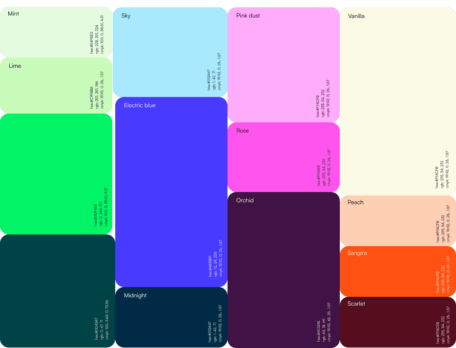
Instead of defining beauty through clean lines and exact application, Chromatica Blur embraces the in-between — where color bleeds, edges dissolve, and identity becomes fluid rather than fixed.


Exploring softness through material, color, and composition.
Each element contributes to a diffused, sensory visual language

Softness is not a lack of control — it’s a different kind of precision.


Translating to brand identity that makes you feel the product before even getting to it.
The visual system
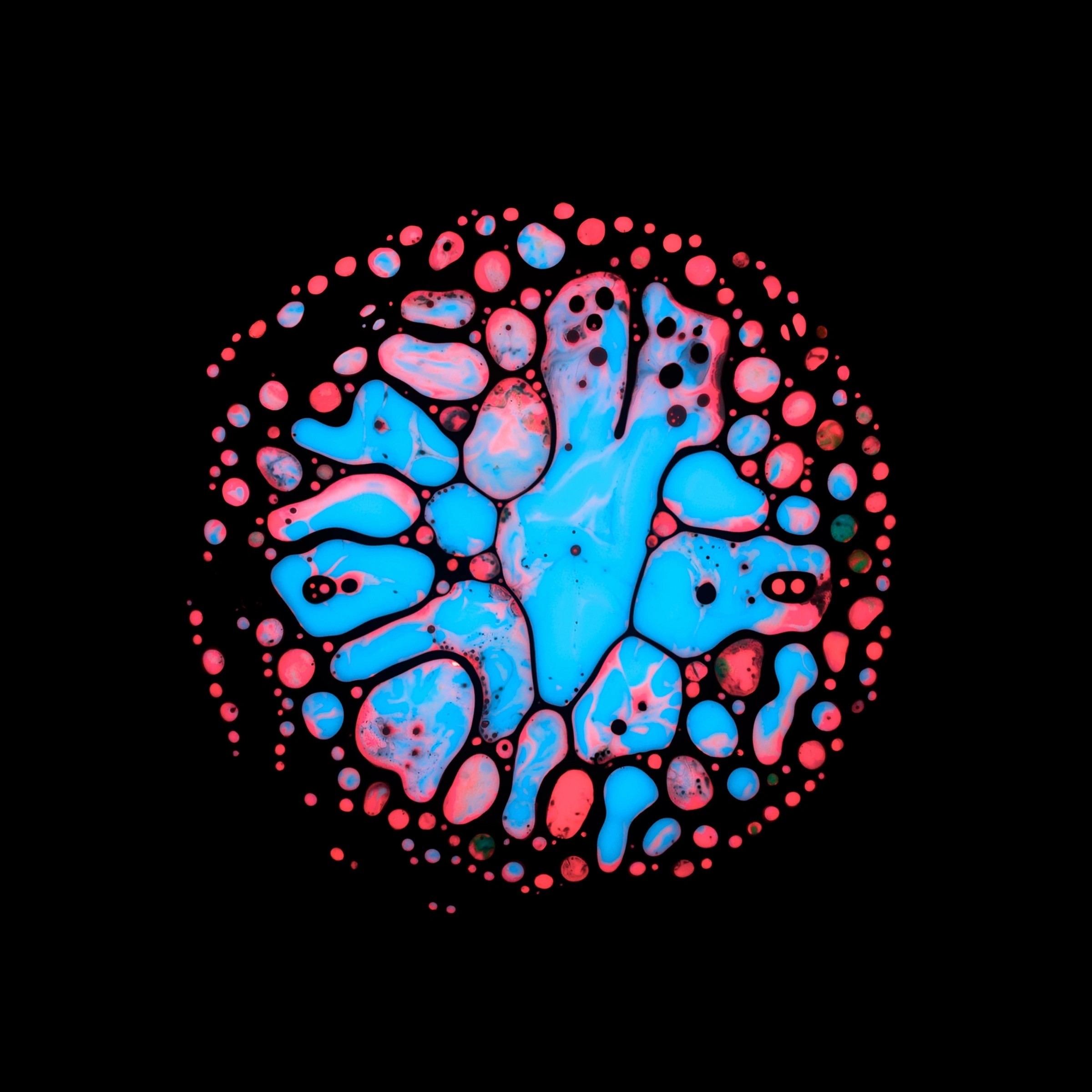
is built around softness, depth, and controlled imperfection, translating the idea of “blur” into a tactile, almost cinematic experience.
Gradients dissolve into each other, edges lose their rigidity, and surfaces feel fluid — echoing the way modern beauty shifts away from precision toward expression.
The design
balances minimal structure with rich visual interaction.
Each composition adapts through variation in blur, opacity, and layering — creating consistency through atmosphere rather than repetition.


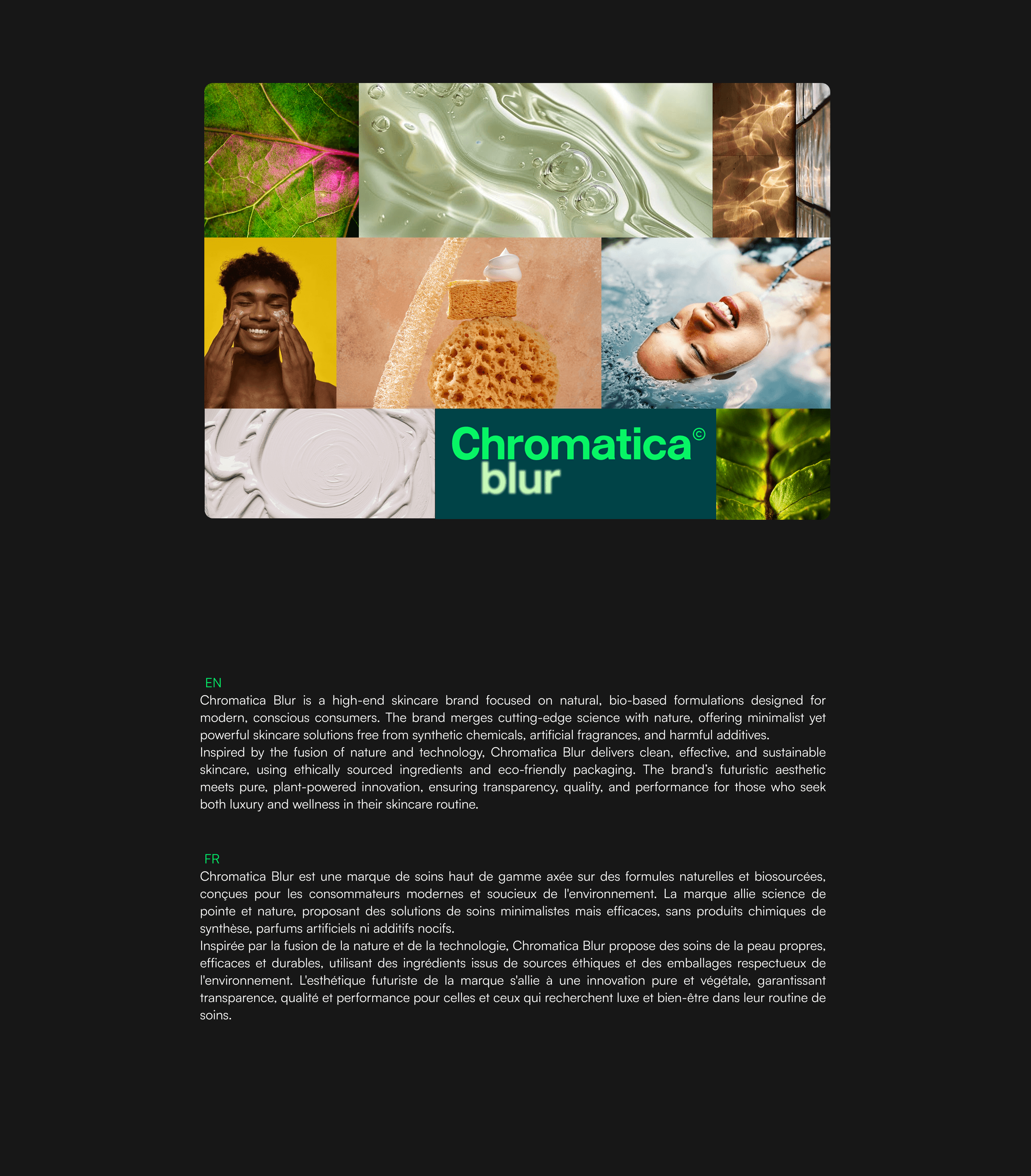
Chromatica Blur
reframes beauty as something felt, not defined.
It moves away from perfection and toward presence — where softness becomes strength and ambiguity becomes identity.


My Work


Newsroom